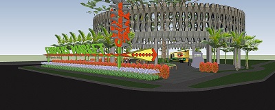

COMMERCIAL LANDSCAPE ARCHITECTURE
COMMERCIAL LANDSCAPE ARCHITECTURE SEGMENTS
condominiums association landscape design storefront design business identification sign design entry feature design roadway landscape design luxury resorts landscape architecture theme park landscape architecture design landfill landscape design and landfill closing residential communities landscape architecture |

LICENSED COMMERCIAL LANDSCAPE ARCHITECT
As landscape and environment are becoming hot trending topics many cities and county agencies are responding by requiring that landscape plans be prepared by a licensed landsce architect. In the past it was acceptable by some communities to allow engineers to prepare landscape plans. This resulted in mundane struggling landscapes as these engineers were merely selecting plants from a list without consideration of exposure, soil and site conditions or aesthetics. Many of these government reivew agencies are no longer accepting landscape plans prepared by engineers it is imp. Communities that have consistently required landscpe plans by licensed landscape architects have developed to be communities that prosper. These communities have a consistant canopy cover, vibrant commercial core, top rated school, parks and social systems. Communities that have traditionally accepted plans provided by engineers tend to be less desirable with many failed systems. Well planned and successful landscapes must include a thoughtfully designed tree canopy. It must be noted that successful, vibrante and economically advantageous communities worldwide are communiteis containing that protect and enhance their tree canopy. Adversely, struggling communities lack tree canopy and do not have any protection in place. As a business owner, developer, development attorney or other interested party you must ensure that your commercial landscape design professional is a licensed landscape architect. As the state of Florida and many other states allow the practice of "landscape designer" a differentiation must be made. To learn more about the benefits of hiring a licensed landscape architect please go to our DESIGN PAGE. 
THE AMERICAN HEART ASSOCIATION, ORLANDO FLORIDA |
about
projects
contact
main
![]()
COMMERCIAL
FLORIDA COMMERCIAL LANDSCAPE ARCHITECTURE
BY:
LAND ART LANDSCAPE ARCHITECTURE
some insight
on landscape design and commercial properties
APARTMENT COMMUNITIES AND CONDOMINIUM LANDSCAPE ARCHITECT
This bait and switch philosoply coincided with the invention of Auto CAD technology and allowed design professionals to increase profit levels and decrease work loads. With a simple copy and paste and a text edit a new apartment community was born. This still continues yet some developers have taken pride in their communities and understand the benefits of professional design. Once again, iconic signs are being created for iconic apartment communities. The battle for better design is not over yet. Many greed machines invest as little as possible and are only willing to do the bare minimum. Negotiating design fees, battling develpment standards and even battlign the communities in which they intend to integrate into. Investing in attorneys instead of design only creates enemies within their proposed community, alienating their future residents. This also builds bad will within the design review community and qualified design professionals tend to over price their proposals with such developers to prevent them from injecting themselves into certain developers controversies. Some time during the late 1990's and early 2000's it became a design trend to paint everything in shades of brown or drab yellow's. This lack of color consultation prior to painting a commercial building resulted in depressed communities that all look the same. What we refer to as the 'Wal Mart Color Palette' began to cover our communities. Even Publix Super Markets who were traditionally a clean white establishment adopted the 'Wal Mart Color Palette' destroying a part of the charachter of their clean stores reputation. Rule Number 1, always opt for super white when in doubt of color selection. Understanding the fabric of the community in which a proposed apartment community is being designed for and placing the appropriate skin on to that apartment community is one of the main ingredients ot a fully occupied and healthy apartment community. Add iconic signage design to that community and it will be warmly welcomed into the community into which it is being placed. |
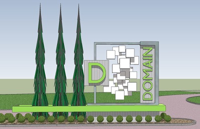
APARTMENT COMMUNITY ICONIC SIGNAGE
HOMEOWNERS ASSOCIATION LANDSCAPE DESIGN
You may wonder, with this common sense fact and understanding why do so many community entries look unappealing, dated and or decaying? The unfortunate circumstance that in most cases the person or persons in charge of making decisions about community common areas are typically not the people who should be making such decisions. Now that we have stepped on toes, anyone who is still reading this article must have a true understanding of design and a genuine care for the cure of their communities situation. As a result of this circumstance Land Art Landscape Architecture insists that all initial meetings with Homeowners associations, property owners associations, community associations meet certain requirements including a public meeting with the members of the association and a fee for such meeting. This is in the best interest of investing our valuable time with clients who are concerned with design and the results of qualified design. |
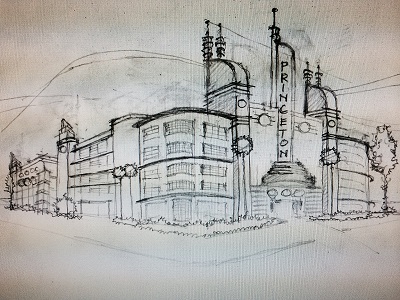
CONCEPTUAL DESIGN FOR THE PRINCETON, A COLLEGE PARK APARTMENT BUILDING
STOREFRONT DESIGN
Catching the eye of passing motorists and pedestrian is a goal of the successful design, thus creating a landmark status to the user of your business location. The target customer must feel as if your storefront design presents a clean, safe and visually stimulating experience. If any of these three emotiosn are not met the passing customer becomes a missed opportunity and mental landmark status is not achieved. At Land Art Landscape Architecture our storefront designs result in extended customer experience, higher average ticket and return experiences for all of our commercial storefront design customers, turning your location into a landmark. Imagine your business as the cool place, you know, that place with the cool sign and lush landscape, yeah, I know that place... it is our next design customers storefront. Starting from scratch provides for a collaboration between landscape architect and architect, to work toward the mutual goal of landmark status. Upgrading an existing storefront always starts with the basics of clean doors and windows. Removing the posters, bills and other clutter is one of the basics of storefront design and a CPTED principal. Once the clean up is complete a new design can be developed for your storefront by Land Art Landscape Architeture. This new design will consider the architecture of your building as well as other design criteria that our customers indicate. Your design will result in a throughtful well planned design that creates landmark status for your business. Taking over and renovating a location may begin with removing several layers of bad attempts to get to teh bones of the building. Once the true architecture is discovered the landscape architect can work toward designing with the architecture to develop landmark status considering the clients goals and design guidelines. Understanding the benefits of professional design is a key to transforming a cliets business into a landmark. Once a business develops landmark status the owner will reap the rewards of their design investment. |

AL FRESCO CAFE DINING BY LAND ART LANDSCAPE ARCHITECTURE
INFUSION TEA, EDGEWATER DRIVE, ORLANDO, FL


|
A BIT OF FREE ADVICE
Designing Storefronts for identity, iconic developmetn and lowering the chance of crime seems to be an unecessary evil, but proves to function in both residential and commercial situations. Below are some basic guidelines. Avoid fluffy names for your business, names such as 'feather your koala bear' will not result in positive customer draw. When considering signage design simple may be better, if in doubt use Helvetica font. Opt for white when in doubt of color selection, not off white, but bright pure clean white. Sherwin and Williams will sell you super white. Clean windows that are free of banners, posters or advertisements will be inviting to new customers and allow existing customers to feel safe while visiting your business. DESIGNING FOR SAFETY AND SECURITY Designing Storefronts for lowering the chance of crime seems to be an unecessary evil, but proves to function in both residential and commercial situations. Below are some basic guidelines. Maintain premises and landscaping such that it communicates an alert and active presence occupying the space. Weed growth is an example of a sign of neglect. Clipped plants shows the opposite. Provide trees, and more trees. Research shows that commercial spaces with more trees are seen as significantly more attractive, more safe, and more likely to be used than similar spaces without trees. Avoid overly bright lights at night. Remember, the brighter the light, the darker the shadows, ergo more opportunities to hide. Placing amenities such as seating or refreshments in common areas in commercial, institutional and recreational settings help attract large numbers of desired users. Invest in a bench! Scheduling activities in common areas increases proper use, attracts more people and increases the perception that these areas are maintained, observed and controlled. Avoid cyclone fencing, razor-wire fence topping or other foreboding barriers, as it communicates the absence of a physical presence of both police and citizens, therefore a reduced risk of being detected of criminal activity. Acknowleding that you must qualify the design talent that you hire by insisting that they be licensed professinal landscape architects with the Florida Department of Professional Regulations. read more via wikipedia
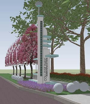
ENTRY FEATURE SIGN CONCEPT, COLLEGE PARK |
COMMUNITY CODES AND COMMERCIAL LANDSCAPE ARCHITECTURAL DESIGN
To sum it up, a visual degredation on any given street, such as an unreplaced broken window, encourages more neglect, littering, deliquency, malicuous property damage, etc. It sends a message that, in this area, no one really cares. Homeowners and businesses often complain about the strictness and triviality of these laws, but no matter what location; the stricter the codes, the more desirable the neighborhood. 
ICE CREAM PARLOR STOREFRONT
|
